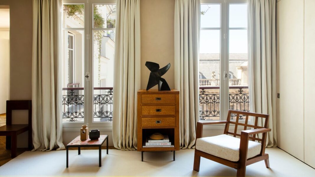
When a Haussmann-era building in the heart of the Marais had a rare corner apartment available, Belgian interior designer Marie Stadsbader was immediately drawn to it despite its relatively small size; she knew that she wanted it as her Parisian pied-à-terre. “I come here often for work,” she explains, but her deep love for the French capital goes beyond her business commitments. In her search for a Paris home, she knew she wanted to enjoy a view of the city’s iconic rooftops. This apartment also offered an exceptional view of the courtyard of the Museum of Jewish Art and History, with no fewer than six windows overlooking it. “With its very high ceilings, it felt very French, and it also had a grand staircase and a magnificent view,” Stadsbader says of the 678-square-foot space that she has transformed into an open and inviting home.
The suite life
“I wanted to be able to see the view as soon as I walked in the front door, and enjoy it from the living room, the bedroom, everywhere in the apartment,” Stadsbader says. “I didn’t want the space to feel too small, so I removed doors that were taking up space.” They were replaced with curtains similar to traditional Japanese noren (door curtains). The rest of the layout was designed to resemble a hotel suite, in order to make the most of the limited space. “I put a bathtub in the bedroom,” she says, “to continue the theme of creating a hotel-like atmosphere. Now I can enjoy the view even when soaking in the tub.”
Andrée Putman as design inspiration
Stadsbader also used an understated palette of colors to make the apartment appear larger than it is. “I painted the apartment’s walls the same color as the museum’s façade,” she explains. The challenge was to create a warm interior, enhanced with subtle touches of stainless steel and mirrors. “Everyone thinks stainless steel is cold, but I find it warm because it reflects light everywhere, just like mirrors.” Much of her inspiration came from her home in Belgium: “I live in a house that was designed by Andrée Putman 30 years ago. I haven’t changed anything about it.” Inspiration from Putman can be seen in the apartment’s proportions, the stainless-steel accents, and the door handles. The most notable point of departure is the absence of mosaics and tiles, which Putman used in many of her projects.
The finishing touches
Also inspired, of course, by the very Parisian charm of the apartment, Stadsbader had Versailles oak flooring installed. “I chose small dimensions for the boards to create a greater sense of space. If you work with wide planks, you need more room,” she notes. Thin drop ceilings were also added for sound insulation. Stadsbader also took the opportunity to incorporate elegant, understated moldings. “I lost only about four inches in height, and so was still able to keep the effect of the tall ceilings,” she says. “I didn’t want to use cornices due to a lack of space, and also a fear of creating something that looked fake, but I still wanted a way to define the different areas.”


